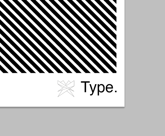
'T' is for... Type.
Typographic Print Design & A-z Print Series Concept
Typography & Print
'T' is for... Type. An A3 sized print incorporating Black to White mono chromatics and Bit-map effects. This particular piece focuses on the letter 'T' showcasing the character, constructed in 3D, contrasted by a vibrant repeated Bit-map pattern, creating illusionary effects.
Designed to be visually impacting whilst using minimal amounts of colour, this typographical print was intended as a concept for a whole series of prints, in which this style could be replicated to each letter of the Alphabet. Inspired by recent retail trends this print series was intended to attract consumers who desire an element of personalisation within there homes or lives. The addition of type at the bottom of the page allows also for the use of slogans and logo identities to be placed allowing for further personalisation referring to the letter in question.